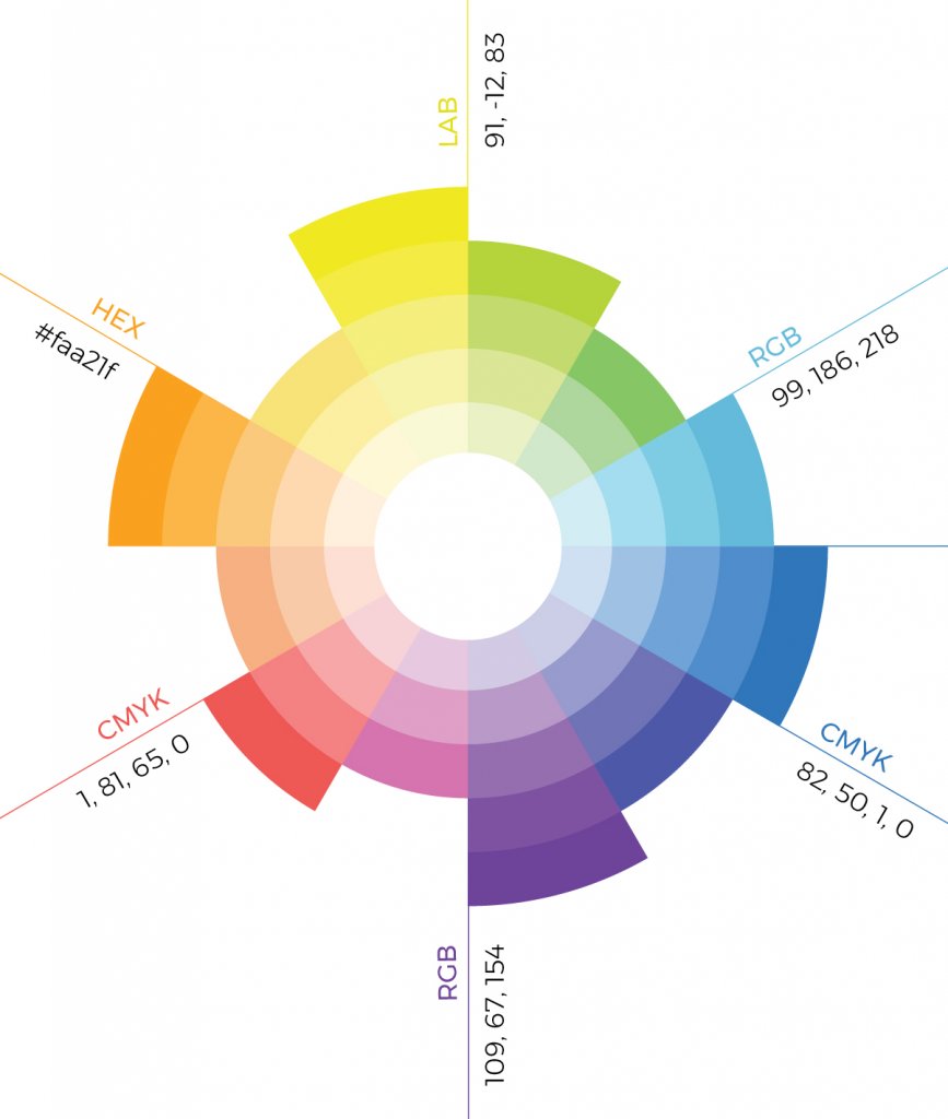
Color is one of the most important factors affecting the perception of space. The color you choose for design is very important for the user’s perception of space. For example; for some, a place dominated by dark colors may have a depth, soft and relaxing feel and for others, it may have a pessimistic effect. In the color palette I will use for a particular design, I care about the shades as much as the colors.
right color palette for interior design
Color is one of the most important factors affecting the perception of space. The color you choose for design is very important for the user’s perception of space. For example; for some, a place dominated by dark colors may have a depth, soft and relaxing feel and for others, it may have a pessimistic effect.
For this reason, I act according to the personal preferences of the clients in a single or certain number of places such as residential and office. I prefer soft and less risky colors in order to catch the general appreciation of the target audience in commercial projects (based on my experience) with intensive and variable users such as restaurants, hotels and sports centers. Colors affect your mood after a while; maybe even make you never come back to that place.
use of color
In the color palette I will use for a particular design, I care about the shades as much as the colors. There is a big difference between a gray dominated by blue and a gray with red intensities. The color you want to emphasize must be in the sub-tones of the other colors you use. Bringing another color to the foreground or throwing it out of focus is directly related to other combinations in your palette. Choosing a light color to create a bright effect is correct, but to emphasize it, either a few contrast colors should be used, or the same color palette with contrast tones should be considered.


