
Social and cultural projects, in particular our schools and education buildings employ colour to good effect. Whether to recognise and respond to local context, to aid wayfinding, or to offer a sense of cohesion and belonging, considered colour choice is vital. We do not just think of colour in terms of twodimensional planar surfaces, rather we embrace the three dimensional introduction of colour and form when experienced in conjunction.
color
The decision to incorporate colour and the process of selecting the colour palette for a building is an intrinsic part of the design process. It will inevitably have an influence on the architectural personality of the place or space as envisaged during the initial design stages. Colour reflects an emotional response, and sends coded messages in terms of what the architecture and interior design itself aims to ‘signify’. Colour can be subtle or bold, contrasting or blended, and even discordant and jarring if this is what is required.
Johannes Itten at the Bauhaus aimed to quantify and record colour sequences in a scientific manner, and his work is still a reference point for global award-winning architectural and interior design practice Scott Brownrigg.
Social and cultural projects, in particular, our schools and education buildings employ colour to good effect. Whether to recognise and respond to local context, to aid wayfinding, or to offer a sense of cohesion and belonging, considered colour choice is vital. We do not just think of colour in terms of two-dimensional planar
surfaces, rather we embrace the three-dimensional introduction of colour and form when experienced in conjunction. Colour is mutually inclusive to all strands of our architectural and interior design thinking, and we recognise the need to enhance, modulate and articulate our buildings though it’s intelligent application.
We illustrate this point with a case study on Three Rivers Academy, a Secondary School and Sixth Form located in Walton-on-Thames in the UK. The school was shortlisted for the Best Use of Colour and the Best School Project categories at last year’s World Architecture Festival.
Kişilik sahibi, nitelikli bir okulun öğrencilerin yaşamları üzerinde bırakacağı bütünsel etki hafife alınamaz.
role and function of color
Three Rivers Academy utilises colour as a way of breaking-down and managing the sheer number of students that are educated at the school every day.
The newly designed pedagogical system enables students attending the 1,800 place Academy to belong to smaller uniquely coloured ‘Houses’ thereby gaining a sense of belonging and ownership. These Houses within the Academy are ‘Claremont’, ‘Hampton’, ‘Richmond’ and ‘Windsor’, with students within each identifying closely with their House and those within it.
These are designed to operate in a hierarchical nature, with the top floor privately reserved exclusively for members of that House. As you travel downwards through the building, the partitioning decreases and the accessibility and permeability increases until you reach the ground floor whereby there is no division. This allows for more focused, quiet learning tasks to take place on the top floors.
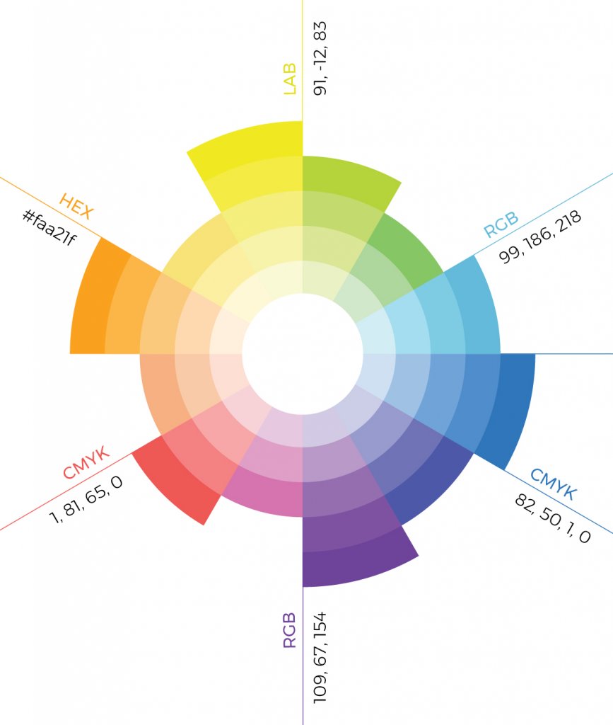
The architecture, materiality and colour embody this pedagogical approach, with four cantilevering blocks designed in the style of modern houses, each with a unique brand and colour. We went through extensive testing to determine the colour ranges for each of the four Houses – they needed to be bold enough to generate their own identity and hold their own, but unique enough to contrast against the other three building strands. Claremont is lavender purple, Hampton is honey yellow, Richmond is a marine turquoise and Windsor is a strong amber. Not content just with the four, we worked with the facade contractor to provide a further three subsets within each of the colour ranges. This striking facade also creates an impactful sight when viewed by passengers travelling on the adjacent railway line to and from London.
However; we didn’t want the colour to be restricted to just the external envelope. Similar to a stick of rock, if you dissect the building anywhere along its length the House colour is revealed inside. This approach has not only strengthened the overall strategy, but has also provided intuitive wayfinding.
Internal floor finishes, walls, ceilings and even the steelwork all match the colour of their corresponding House. Even at the micro level room signage and classroom numbering plaques have been fabricated to the same proportions as the House gable-ends.
‘The Mall’ on the ground floor runs the full length of the school. Here we designed the wayfinding to be naturally observable with floor finish colours that dissect The Mall in a tone of the House group above. This coloured floor finish continues through into the vertical circulation stairwells, up to the top floor, enabling users to become intuitively aware of their location.
We believe that the design of the building, and the bold and purposeful use of colour have contributed significantly to the positive and transformational learning experience for the students and teachers alike. Providing a school with personality and character that makes an impact on all who use or visit it. The holistic effect it has had on the students’ lives cannot be underestimated.


