Colour is used to influence us through our behaviour and mood, making us move more quickly or slowly, feel more relaxed, eat more, increase productivity and even spend more.
color
As a specialist in Applied Colour Psychology, I think that colour is at the heart of everything we do.
It’s a powerful phenomenon, yet the majority of us take colour for granted and that’s probably down to the fact that colour is only 20% conscious. However; it has long been established that colour is the first thing people notice, and that is the same for the interior space.
Colour is used to influence us through our behaviour and mood, making us move more quickly or slowly, feel more relaxed, eat more, increase productivity and even
spend more. Colour can attract and it can repel. Get this right and you will attract your ideal customers, clientele. Get this wrong and it will repel them.
Industry designers and architects have an incredible social responsibility as they can often directly influence millions of people’s lives every single day by the colour choices they make.
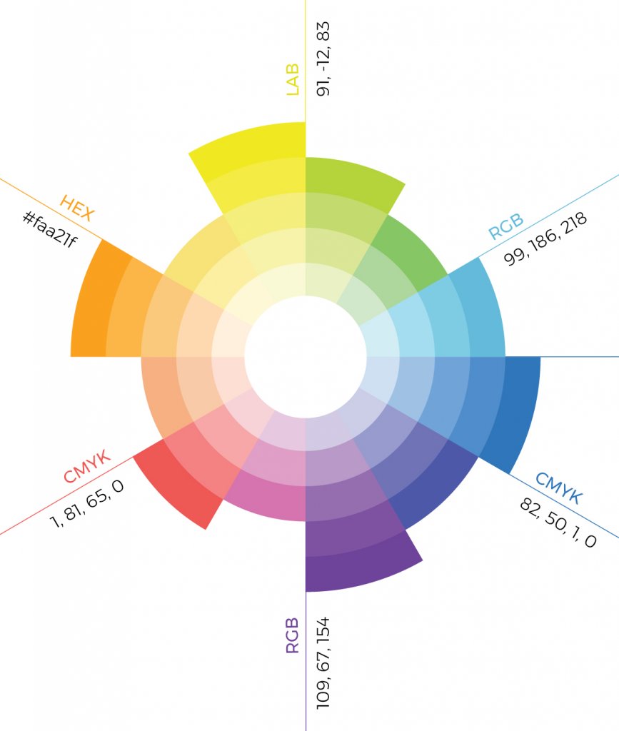
Colour tone, combination, proportion, and placement are key in any project both from a visual perspective and the overall mood.
effects of color on living spaces
As we increasingly turn into urban dwellers, we find ourselves living the majority of our lives inside man-made environments, such as the home, office, school, buses, trains, cars, planes, gyms, restaurants, hotels, theatres, and shopping centres.
Quite often within these man-made environments, it is very easy to lose connection with nature and its many colours, finding ourselves living within a very limited colour palette which affects us on a physiological level. We are stressing our bodies, our mind and our soul being in unnatural environments.
It is vital designers understand the power of colour and the long term effects for those using the space. Colour tone, combination, proportion, and placement are key in any project both from a visual perspective and the overall mood. Even using the right colour but in the wrong tone and you could end up with adverse effects.
In the UK, when it comes to designing public spaces, the designer faces extra challenges in meeting the Equality Act 2010 BS8300 guidelines whilst still creating harmonious colour schemes that look good, support those using the space and meet the client’s needs, and, to ensure their design is fully inclusive to all.
As we live in more overcrowded cities, the role of the designer to create comfortable environments will become increasingly important and creating harmonious and appropriate colour schemes will play a key part.
Continual colour research can only have a positive effect on raising the profile and understanding of all aspects and influences of colour. I hope this will lead to the elevation of the teaching of colour in the interior design and architectural syllabus.
We have already reached the tipping point in the UK where more people live in the cities than in rural areas. We are changing from being rural to urban species. And by 2050 this will be a global phenomenon.
We have a responsibility to use colour intelligently when it comes to the health and well-being of the global population making the role architects and designers a critical and vital one and therefore the on-going research into colour will be of significant importance.


