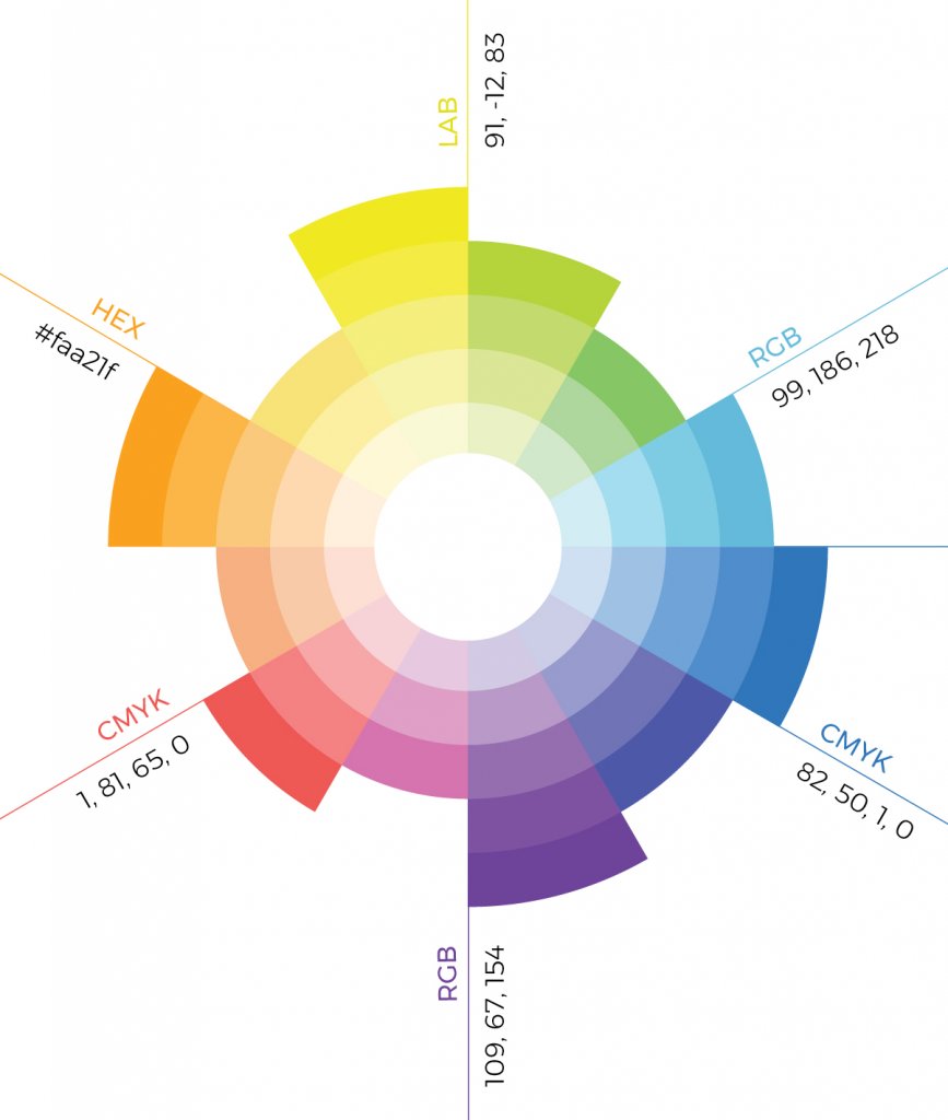
Using a combination of colors is essential for me in order to feel the depth, rhythm, and of course emotions. That’s why I use a multicolor palette in all my projects. The first thing I decide when I start a new design is the number of colors, for example 24 colors for the Sugamo Shinkin Bank, depending on the context, function and my inspiration. White is also very important for me. White is for me the only color necessary to make other colors appear beautifully.
color
For me, color is a medium to create space and emotion. With colors, I try to give emotions to people. Color can make people smile, give energy, joy, and most
importantly they make people happy. I am always on a journey between different scales, from a small art piece to architecture, trying to give emotions to people with colors. I want people to feel color with their entire body.
When I saw the cityscape of Tokyo for the first time, I was so impressed by the colors in the city, thousands of colors seem floating in the cityscape, as layers, as three dimensional elements. It was as if the first time I saw colors. I was so overwhelmed that made me decide to move to Tokyo. The colors and layers I feel in Tokyo were the inspiration to my design concept of “shikiri”, which means dividing (creating) space with colors: “I use colors as three-dimensional elements, like layers, in order to create spaces, not as a finishing touch applied to surfaces.”
effects of color on buildings
Inspired by colors of Tokyo every day, I realized that colors can create a lot of emotions, create a unique atmosphere, felt entirely by the five senses, generating
unlimited emotions. They can make people smile, laugh, surprise, react, talk, in all the cases they create a special moment of happiness.
I consider the facade as a scenery, a story, expressing the concept of the building in an abstract or poetic way. The facade is like the cover of a book. It has to convey a message, attract people, making them naturally enter the building.
For example, there is no signage at all in the Sugamo Shinkin banks I designed. The facade itself, designed as scenery, identifies the bank instead a signage and expresses the concept of the building: “Leaf” (feel the green) for the Tokiwadai Branch, “Rainbow Shower” (merging the exterior and interior) for the Ekoda Branch, “Rainbow Mille-feuille” (feel the sky) for the Shimura Branch, “Rainbow Melody” (feel the rhythm of the season) for the Nakaaoki Branch.
I created the most beautiful 100 shades of colors to create my own personal 100 colors palette. I want people to breathe and immerse in 100 shades of colors, to see colors, touch colors, and feel colors with all their senses.
right color palette for projects
Using a combination of colors is essential for me in order to feel the depth, rhythm, and of course emotions. That’s why I use a multicolor palette in all my projects. The first thing I decide when I start a new design is the number of colors, for example 24 colors for the Sugamo Shinkin Bank, depending on the context, function and my inspiration. White is also very important to me. White is for me the only color necessary to make other colors appear beautifully.
In the daily life, people are usually not conscious about color. For the 10th anniversary of my studio in 2013, I revealed an installation series “100 Colors”, which forms space using 100 shades of colors. You never have the opportunity to see in one space at the same time 100 colors. Also, 100 is a familiar number (100%, 100 points, etc.). I created the most beautiful 100 shades of colors to create my own personal 100 colors palette. I want people to breathe and immerse in 100 shades of colors, to see colors, touch colors, and feel colors with all their senses.
I think the most important thing is to be not afraid of using a lot of colors.


